


It’s no secret that our world is going mobile, and not just mobile, but also tablet crazy! Full sized tablets, mini tablets, big phones, small phones, laptops and desktops. There are so many screens out there now, that a website might be viewed on, that it’s no longer a ‘one size fits all’ proposition, when you create a website.
Enter responsive layout. A responsive layout allows you to create one website and then create multiple style sheets that will adjust the layout based on the size of the screen it’s being viewed on. Through handy javascript code, a browser (even a mobile one) can determine which kind of device you are viewing the website through. It can then choose the appropriate style sheet, so that the layout you view is most appropriate for your device.
Responsive layout is a common buzz word these days. By 2014, mobile internet usage will overtake desktop internet usage. (Source: Nielsen) and 74% of consumers will wait 5 seconds for a web page to load on their mobile device before abandoning the site. (Source: MarketingLand). This is why it’s so important to have a site that can adjust to its environment.
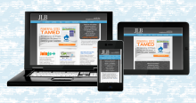
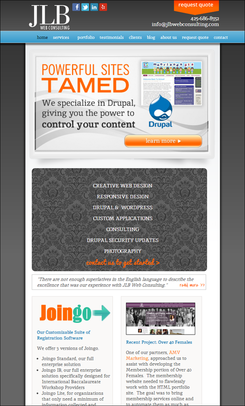
Let’s look at an example of how responsive layout works. If you view the JLB Web Consulting site in a desktop, you’ll see this:

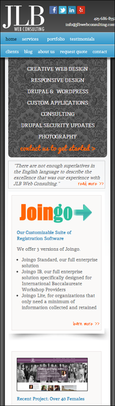
In a tablet, you’ll notice that the blocks of information reconfigure. It’s still the same site and the same look, but the style sheet for the tablet moves the blocks around into a better layout for the smaller screen.
And you’ll notice the same thing with the mobile layout. Everything is now in one column to accommodate the narrow screen.
The beauty of responsive layout is that you can also create mobile navigation or wrap your navigation when necessary. You can even remove parts of the content that may not be relevant or as important in a smaller screen environment (such as graphics or photos that take too much space).
The end result is an easier to browse experience for the mobile or tablet user, which in turn, encourages them to stay on your site and return to it in the future.
Now, how about those costs? Why is it so much money to create a responsive site? Your designer has to create 3 (or more!) designs that show where the break points of your site are going to be. In other words, they have to create the look for the desktop and then modify that look for the tablet and mobile environments. Most designers will recommend 3 sizes, but it’s possible to design for more, depending on your audience. Once those designs are finished and approved by the client, the developer has to write the code to look for those break point screen sizes and then create the multiple style sheets to accommodate each break point. Not only that, the developer has to take into account the site being viewed on a multitude of browsers!
JLB will typically design 3 breakpoints (desktop/laptop, tablet, mobile/mini-tablet). We make sure that your site looks good at all 3 breakpoints in Internet Explorer 9 and 10, Safari, Firefox and Chrome. So we are checking for 15 possible combinations and ensuring that your site looks great on each and every one of them. Throw in both Android and IOS testing and it doubles.
Responsive layout is an investment into your future. It’s best done when you are creating a new website, but can also be done to an existing website. It will keep your site relevant and accessible. I anticipate the responsive layout will get even trickier in the future, as online shopping through mobile browsers grows!
If you have any questions about responsive layout, don’t hesitate to ask us!